Articles
The Key to Higher Conversions: Optimize Your Nonprofit Donation Form
Design donation forms that inspire trust, boost conversions, and build lasting supporter relationships. Learn what to include, simplify, and optimize.
Share Article:
Thoughtful form design turns moments of giving into lasting supporter relationships.
You’ve been there. You’ve spent weeks or even months planning a campaign, crafting your message, and inspiring supporters to give. But what if one of the most important parts of your donation process was being forgotten? Unfortunately, that critical interaction point is often the one most overlooked: the donation form.
The Form That Starts (or Strengthens) Every Relationship
Your donation or registration form isn’t just a transaction page. Sometimes it’s the first handshake with a new person at the start of their supporter journey. Other times, it’s a warm “welcome back” to a longtime believer in your cause.
Every field, button, and phrase on that page either builds trust or adds friction. A well-designed form can transform hesitation into action and turn a moment of generosity into a long-term relationship.
Good design is about more than beauty. It’s about respecting your supporters’ time, showing their impact, and capturing useful data that helps you serve them better next time.
When your form feels effortless and human, it not only increases conversions but also gives you cleaner insights and stronger connections. Here’s how to build one.
Start With Trust: The Psychology of Giving
A beautiful form might draw attention, but trust is what earns confidence. Supporters give when they feel secure, respected, and convinced that their contribution will make a difference.
Form design is part of that reassurance. Display familiar payment options and SSL security badges. Keep the language warm and straightforward. Most importantly, communicate impact by identifying what their gift accomplishes in the real world.
Short, specific copy works best: “$25 provides three meals for a family,” “$100 supports a week of after-school programs.” These statements turn abstract generosity into tangible results.
Consider adding subtle social proof: a quote from a volunteer, a short progress bar showing momentum, or a few words about community involvement. They act like visible applause to cheer on the donor, basically a reminder that others believe in this cause, too.
A pretty form catches the eye. A purposeful form keeps supporters. When people understand the effect of their giving, they feel part of something bigger and that feeling sustains loyalty.
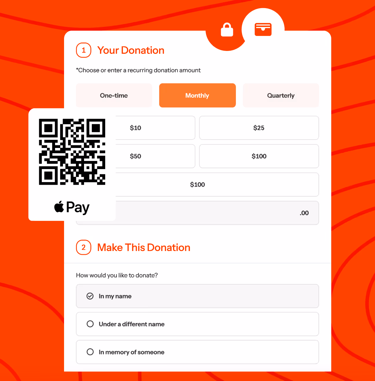
The Anatomy of a High-Performing Donation (or Registration) Form
Your form should be inviting, simple, and built for how people actually give. Here’s what matters most.
Keep It Simple and Intentional
Try to ask only for what you truly need. Each extra field lowers completion rates.
You can always ask later, in context. If you need more details for event participants or fundraisers, create a separate flow rather than forcing everyone through the same form.
Fewer fields make supporters feel respected. Clarity makes them confident.
Offer Choice Without Confusion
Preset donation amounts reduce decision fatigue, but make them meaningful. Label each amount with impact: “$50 = supplies for one classroom.” Always include a custom field for flexibility.
Offer recurring giving as a friendly default: “Make this a monthly gift.” Empower, don’t pressure.
Show Immediate Impact
Language around your call to action matters. Replace “Submit” with “Join Us,” “Give Hope,” or “Help a Neighbor Today.” Add a short line above the button. This could be something like “your gift today will save 10 Toucans” to remind supporters of their role in the mission.
Make It Mobile-Friendly or Mobile-First
A huge percentage of donors give on mobile. Design for them: large buttons, minimal text entry, mobile wallets, and short scrolls. Test your form on multiple devices before launch.
Keep It Focused and Don’t Turn Your Form Into a Storefront
It’s tempting to add merchandise or upsells, but cluttering your donation form can turn generosity into checkout. If you include optional add-ons, keep them subtle and mission-aligned. In form ecommerce opportunities should be limited and focused if you include them. A clean form focused on giving will almost always perform better.
Reinforce Security and Ease
Display trust badges, recognizable payment logos, and privacy assurances. Use autofill and real-time validation so supporters don’t get stuck. This ensures that the experience remains positive and impactful.
Design for Data: Your Form Is the Foundation of Better Analytics
You can only measure what you collect. That makes your form design the foundation of your data strategy.
Start by deciding what you truly need to know. Fewer questions almost always mean higher completion rates, so be selective. If it won’t change a decision or a message in the next 60 days, skip it. Ask for more detail only when it’s relevant for example, if you need to measure if a certain message resonates with a particular demographic.
Every field should have a purpose. If you want to capture location, giving type (one-time or recurring), and campaign source to understand patterns over time, consider what you might do with that information when you have it.
When your CRM and donation form work seamlessly together, clean data flows automatically, saving hours of manual cleanup.
Smart form design pays off later. You’ll be able to:
- Identify returning supporters across campaigns.
- See which forms convert best by audience.
- Build reports based on consistent, accurate data.
A thoughtful form is user and data-friendly with thought given to its usefulness in insight and growth.
Boost Giving With Matching Gifts: Integrate Double the Donation
An estimated $4 to $7 billion in corporate matching gift revenue goes unclaimed every year. However, you can tap into this massive opportunity if you use the right tools.
Integrating a tool like Double the Donation directly into your donation process can change that outcome immediately. Consider the evidence:
- Corporate Support is High: 65% of Fortune 500 companies offer matching gift programs.
- Donor Eligibility is Massive: 26 million employees are eligible to participate.
- Donors are Motivated: 84% of donors are more likely to give if a match is offered.
- Gifts Get Larger: 1 in 3 will give larger gifts when matching is available.
For tools that integrate with Double the Donation, like haku, you can secure gift matching directly within your donation form. Research shows that 73% of donors will use a matching gift search field when it's presented on a donation form. Haku's integration with Double the Donation makes this an option for your forms.
By integrating matching gifts as a part of the giving experience, you maximize matches before the donor checks out. Furthermore, your thank-you page can then immediately guide donors through the next steps for submitting their matching gift requests.
This small design tweak is an essential tool for maximizing your daily giving. Integrate it now to unlock critical additional funding and capture every matchable dollar available to your organization, 365 days a year. Learn more about Double the Donation’s Matching Gift Automation Solution today.
Beyond the Transaction: Keep the Experience Human
The giving experience doesn’t end with a click. Your thank-you page is your final impression in an interaction, but also your first chance to begin a lasting relationship.
Make it personal: “Your gift just funded ten after-school sessions!” feels more meaningful than “Thank you for your donation.”
Offer gentle next steps: follow your updates, volunteer, or share the campaign.
Then follow up with a short, mission-centered email that reflects who they are:
- New supporter: welcome them to your community.
- Returning donor: show the difference they’ve made.
- Event participant: share upcoming opportunities.
The fact is that many donations start as favors to friends. The moment after giving is your best chance to connect that action to your cause and thus turn one-time gifts into ongoing engagement.
Measure and Refine Without Overcomplicating
Once your form is live, track how it performs, but keep it simple. Focus on what matters most:
- Conversion rate (visits to completed gifts)
- Average donation size
- Recurring gift opt-ins
- Mobile vs. desktop completion
If one metric changes, adjust one element and note when you did it. This builds a record of what works.
Your goal isn’t perfection. It’s learning. Each insight helps you understand where supporters hesitate and how to make giving easier and more meaningful.
Make Giving Feel Effortless and Intentional
A thoughtful donation form does more than collect payments. It builds trust, captures clean data, and welcomes people into your story.Each improvement turns generosity into a lasting connection and every connection strengthens your mission’s future.
If you’re interested in learning more about how you can optimize your donation forms, check out haku’s solutions for nonprofits or for even more information, request a demo today!